
McDonald’s Design System Website
An intuitive and accessible documentation site that centralizes all UX/UI assets for the organization.
INTRODUCTION
Refreshing the documentation site.
The McDonald's design system team strives to empower our product triads to utilize and understand the functions of the design system, enabling them to create consistent and scalable digital experiences.
The current documentation site lacks visibility and falls short in delivering clear and comprehensive information to the triads.
IMPACT
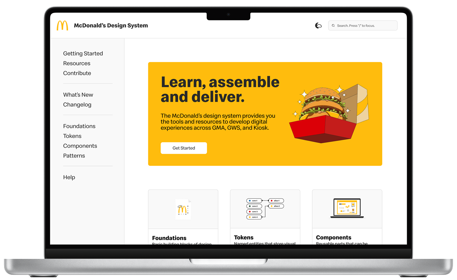
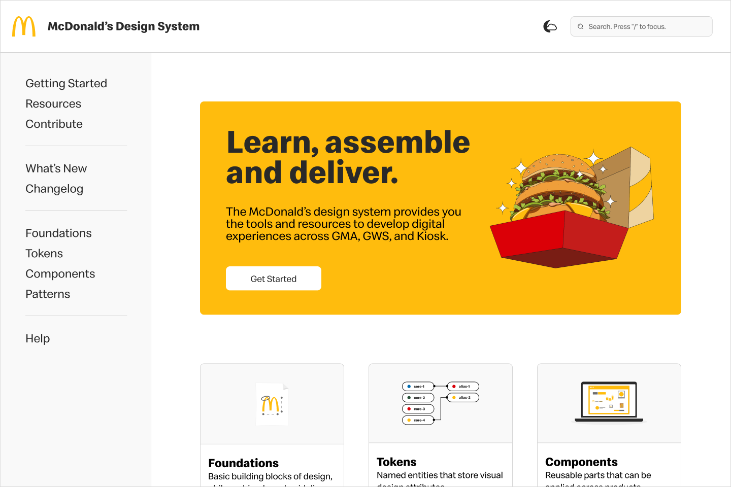
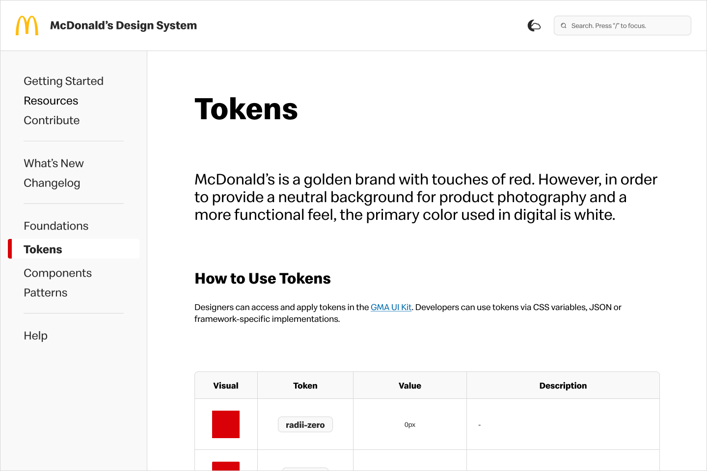
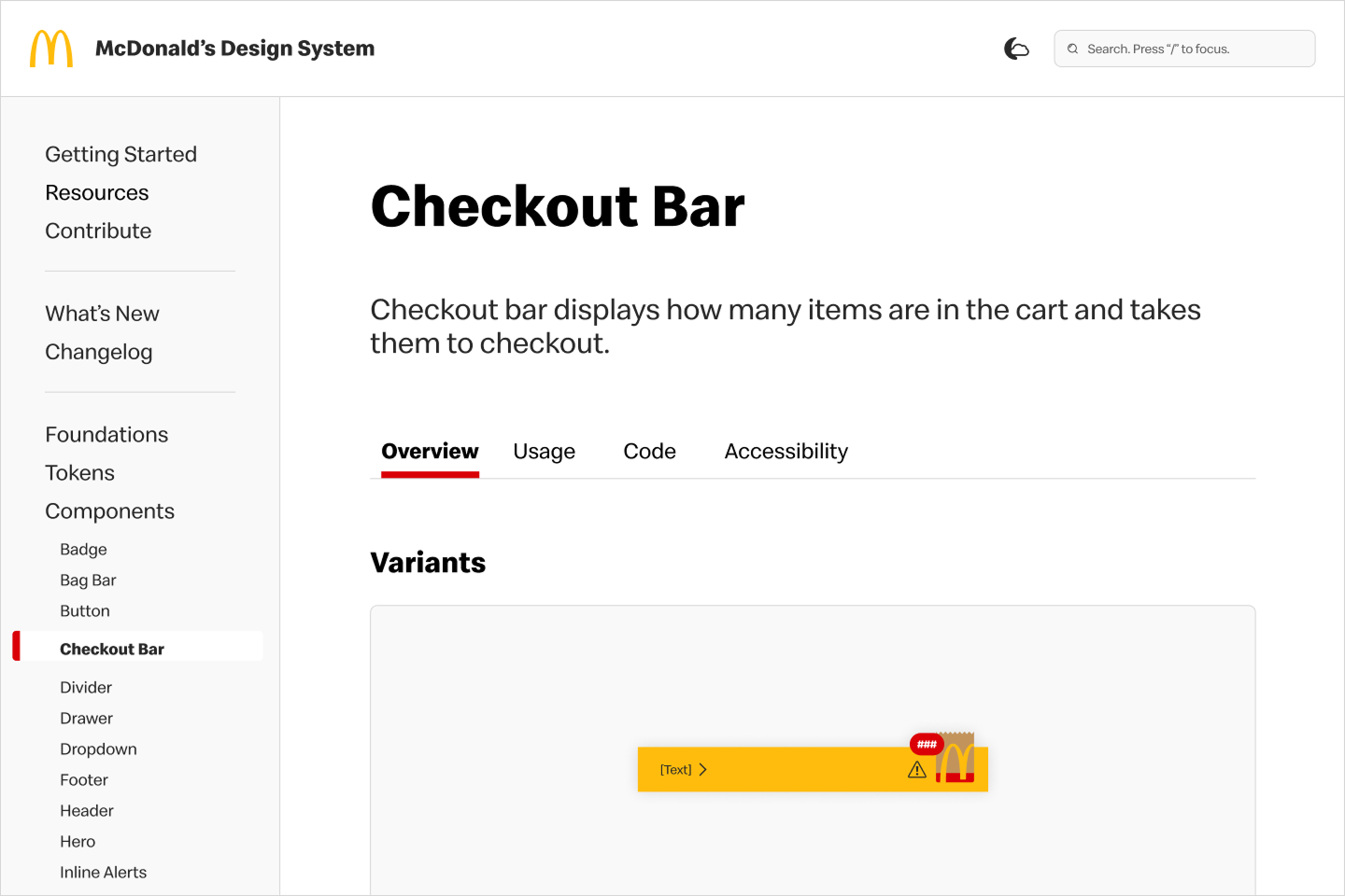
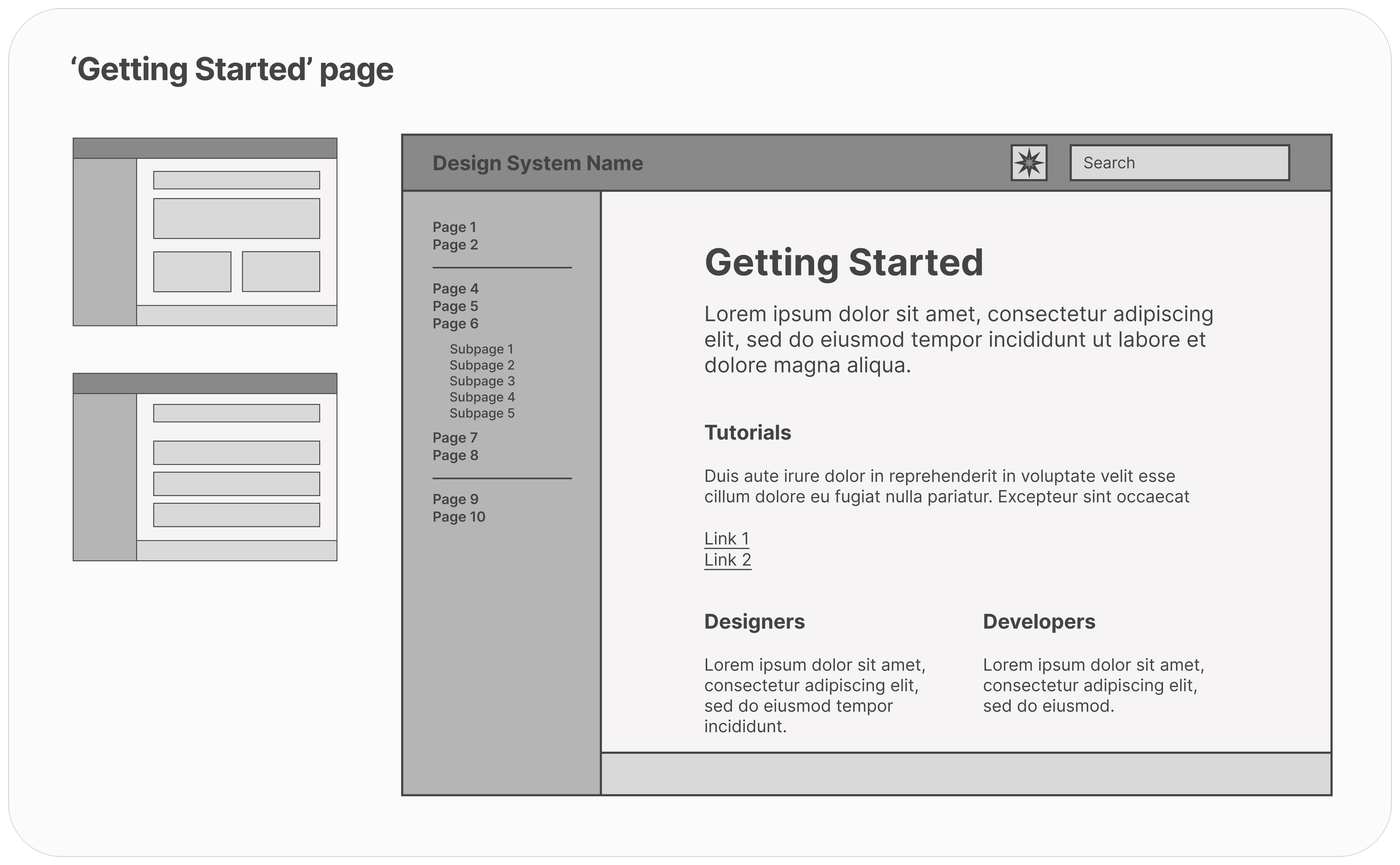
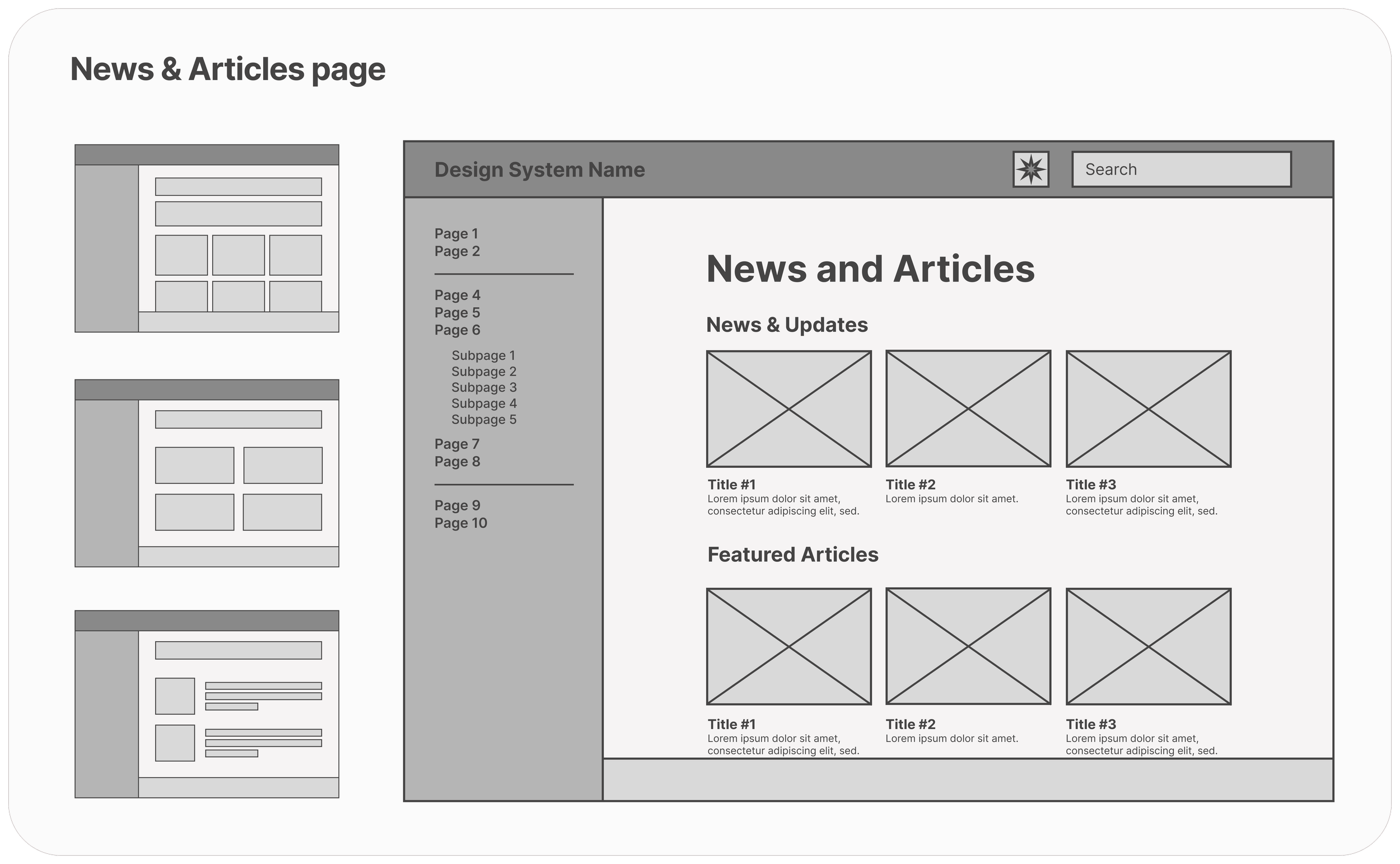
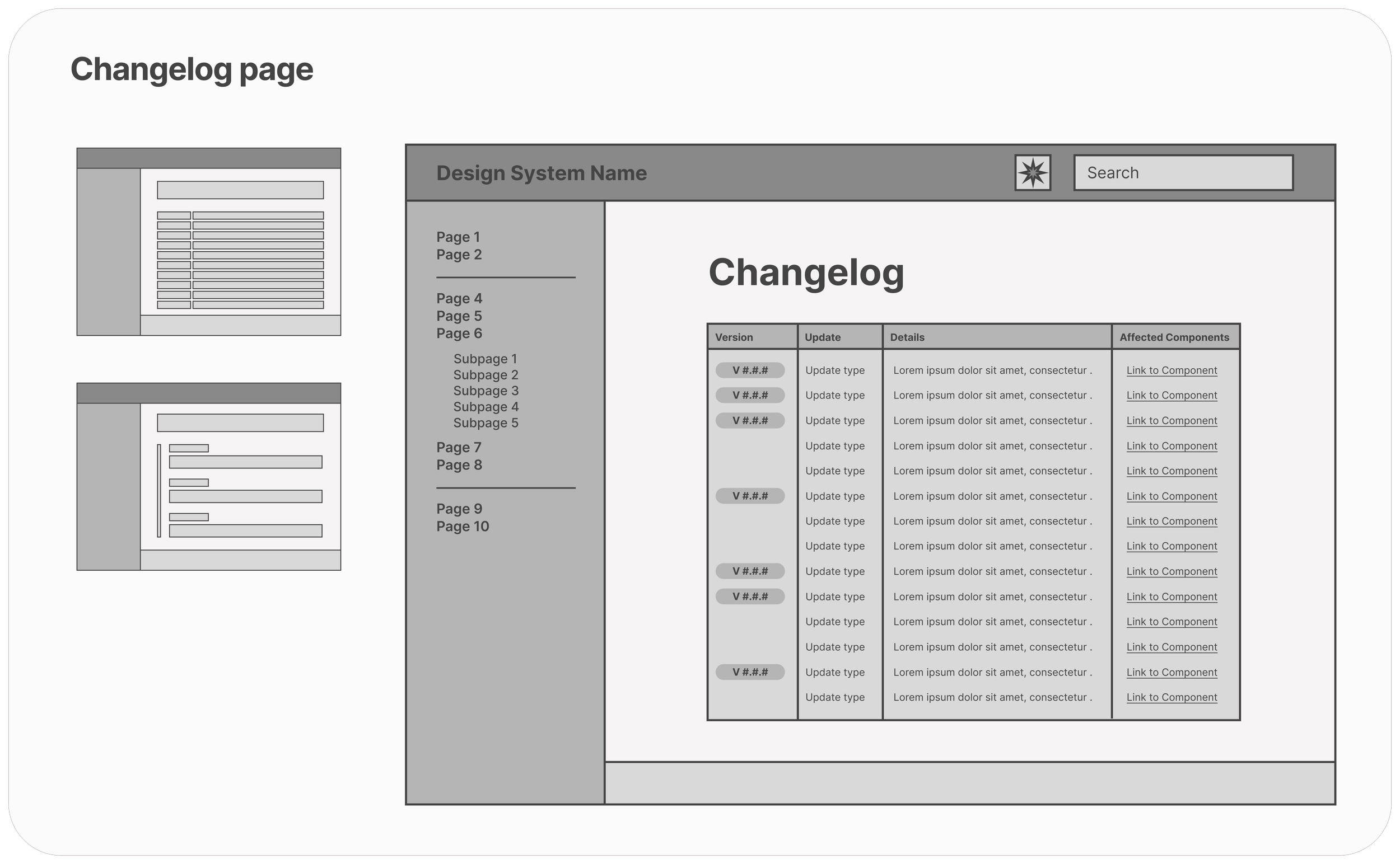
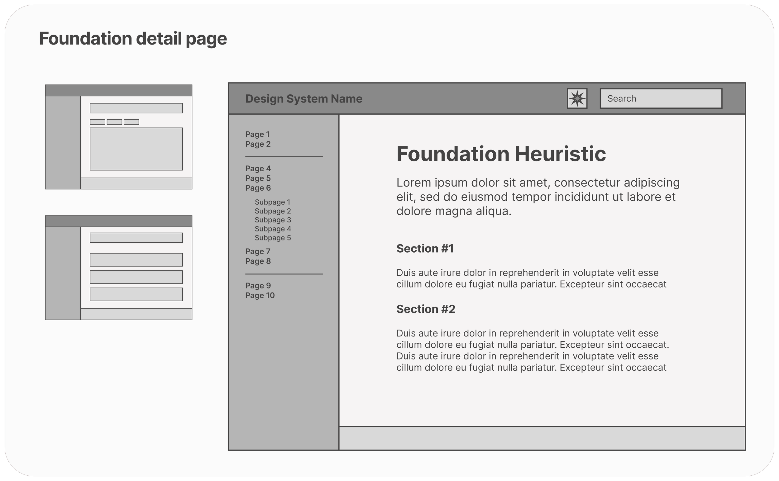
An evergreen, energizing design hub.
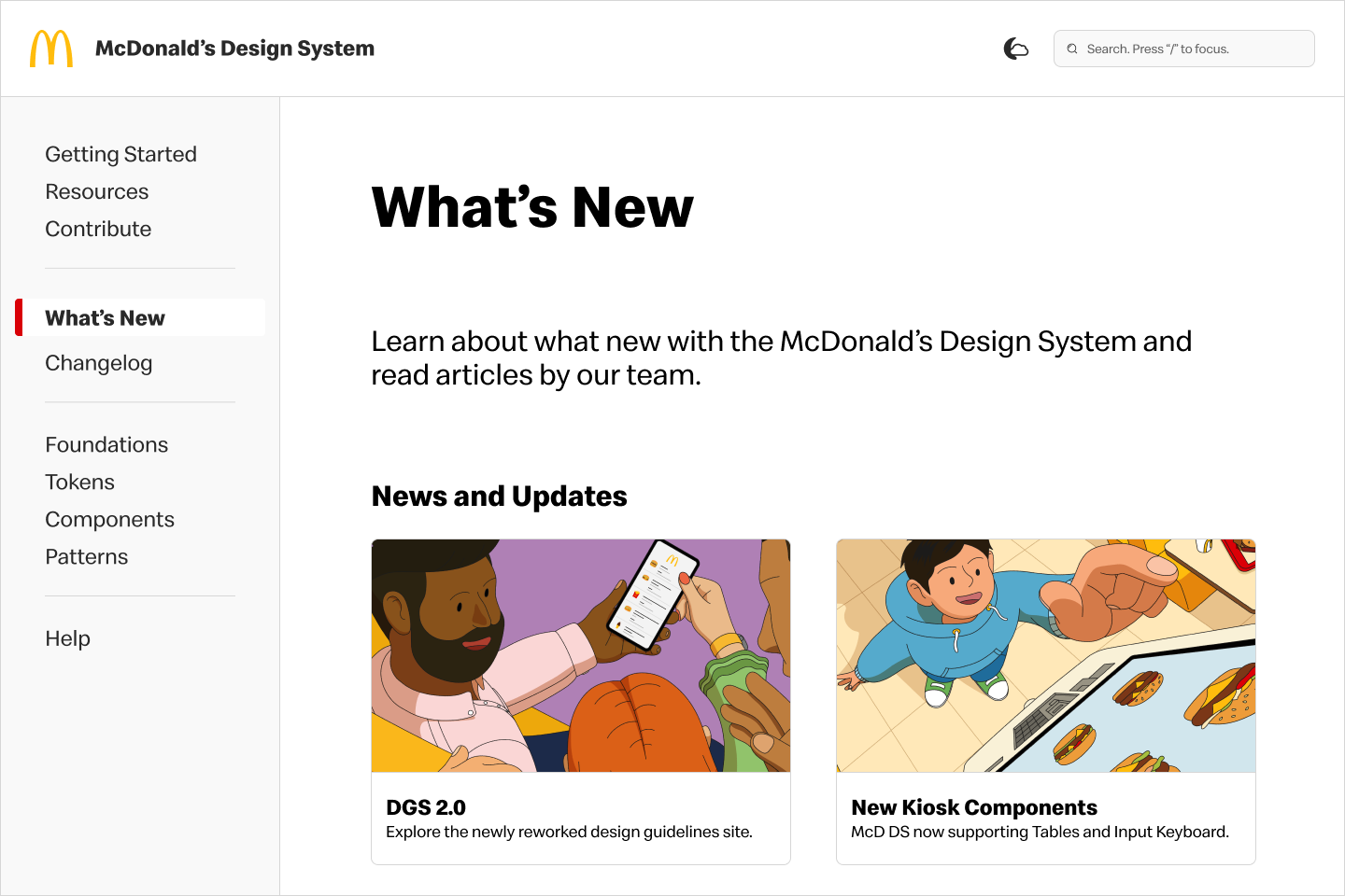
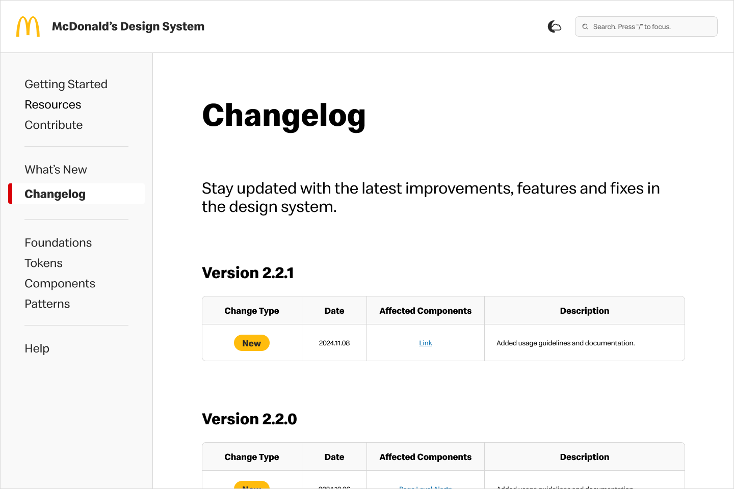
We reimagined the documentation site to be a reliable learning resource that increases engagement with the design system. The updated site features a user-friendly navigation, easily digestible content, user contribution capabilities, and insight into design system news.
TIMELINE
4 Months
May - Aug 2024
TEAM
1 UX Designer / researcher
2 developers
1 product manager
MY ROLE
UX Designer
UX Researcher
TOOLS
Figma
FigJam
The Process.
📊 RESEARCH
User interviews & Pain Points
Competitive Analysis
Key Business Goal
✏️ IDEATE
How might we’s
User stories
Site mapping
Wireframing
🎨 DESIGN
Style guide
Prototypes
📝 TEST & ITERATE
Problem / Solution
🧠 REFLECT
Next steps
Learnings
📊 USER INTERVIEWS & PAIN POINTS
Users engage very little with the current site.
In order to gain a better understanding of our target audience, I conduced 30-minute interviews with 5 product managers, 5 UX leads and 5 tech leads. I focused my questions on users’ impressions of the current site, their needs, learning styles, and how they interact with the design system.
📊 COMPETITIVE ANALYSIS
Competitors exhibit an intuitive and dynamic website structure.
Through my analysis of other companies’ websites, I uncovered key learnings and opportunities that could address our users’ needs while staying aligned with design system trends.
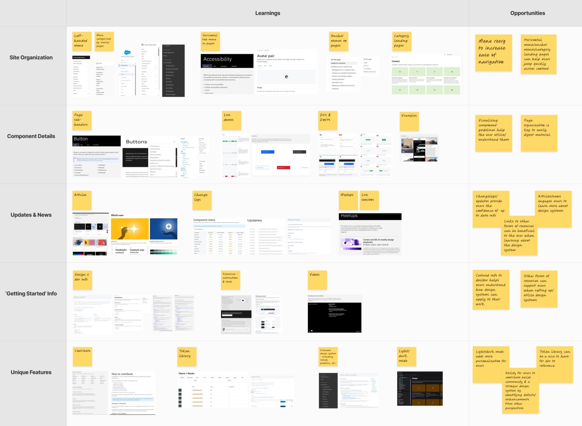
🔓 No clear relation between users’ work and the design system.
📄 Documentation is outdated and lacks usability.
👓 No visibility into design system updates and new initiatives.
🗺️ The website experience is unremarkable and not engaging.
The biggest takeaway from these conversations was that our target audience was not referencing our current site, despite it being the primary source for vital design systems guidelines. The following pain points fell into this theme:
📊 KEY BUSINESS GOAL
Translating key learnings into a north-star goal.
With a north-star, we are able to clearly see the path to success. Our team got together to align on a key business goal that will guide us though the ideation and design of the solution.
🌟 Increase adoption of the design system among product teams by establishing a centralized source that ensures consistent and scalable digital experiences.
✏️ HOW MIGHT WE’S
Actionable questions make for creative solutions.
To facilitate divergent thinking, we constructed statements based on user problems and research. Because the design system has multiple users, we were mindful of the independent needs of designers, developers and product managers when generating questions.
🔎 HMW provide documentation to designers, so they are confident when handing off work to development?
🔎 HMW provide documentation to developers, so they are able to implement designs with minimal feedback?
🔎 HMW make the design system accessible and engaging for triads, so that they are adept at creating consistent experiences?
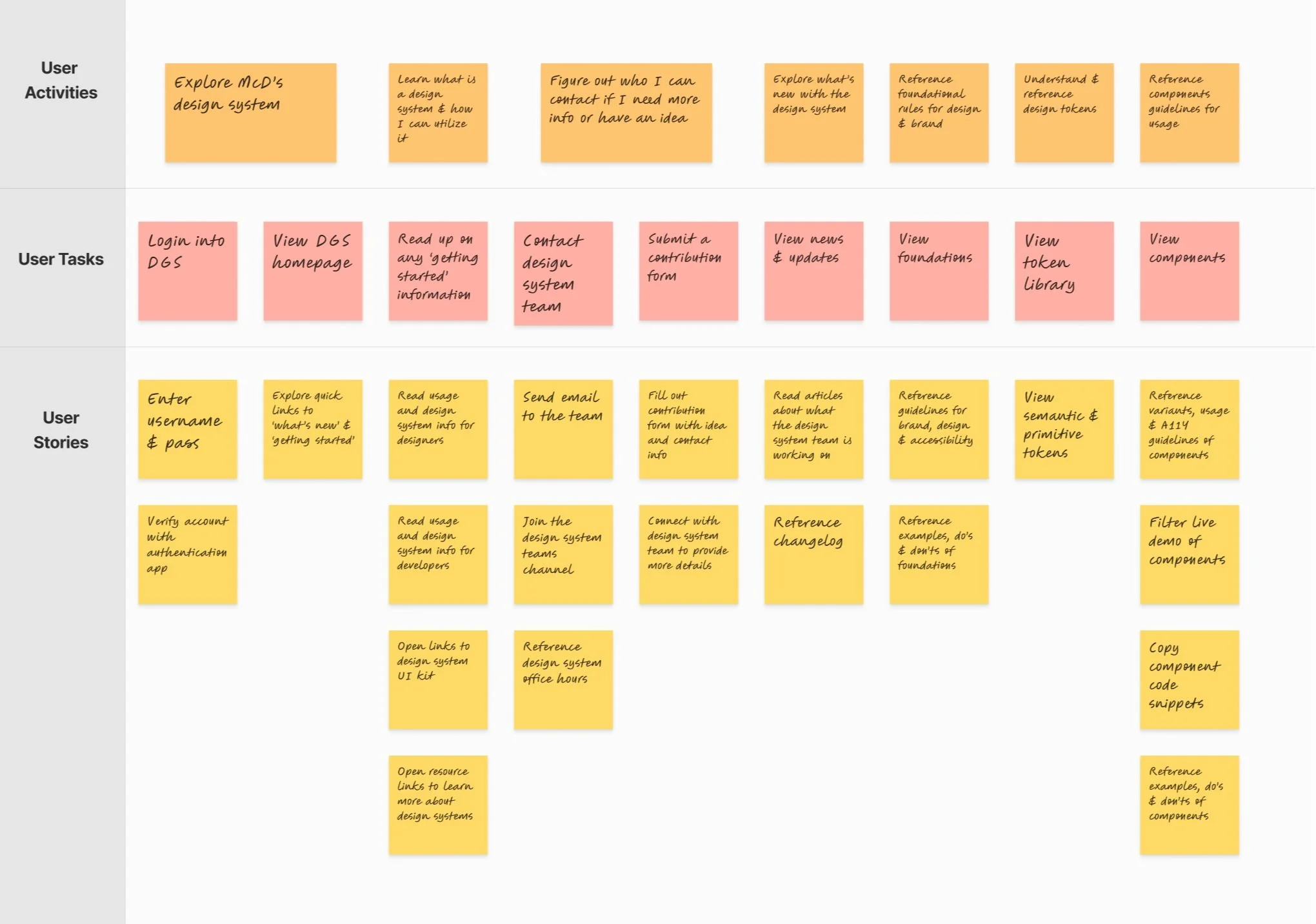
✏️ USER STORIES
Honing in on our solution scope.
Creating tangible tasks from our how might we’s begins with defining user stories. By taking on the perspective of our users, we can understand their goals and how they would achieve them. This outline provides a visual of what we need to prioritize to deliver the best product experience.
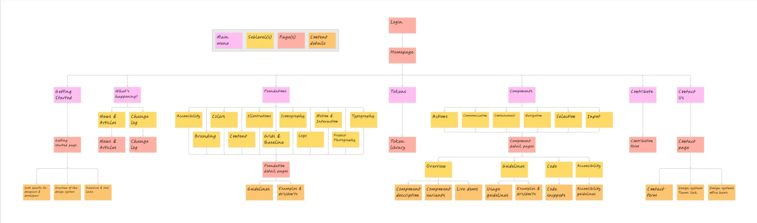
✏️ SITE MAPPING
Keeping simplicity at the core.
A clear and logical structure is needed so that users can easily navigate the website. With the surplus of design documentation, this architecture can easily become complex. Building a site map helped pull out relationships between information and refine the hierarchy for a more organized and user-friendly website.
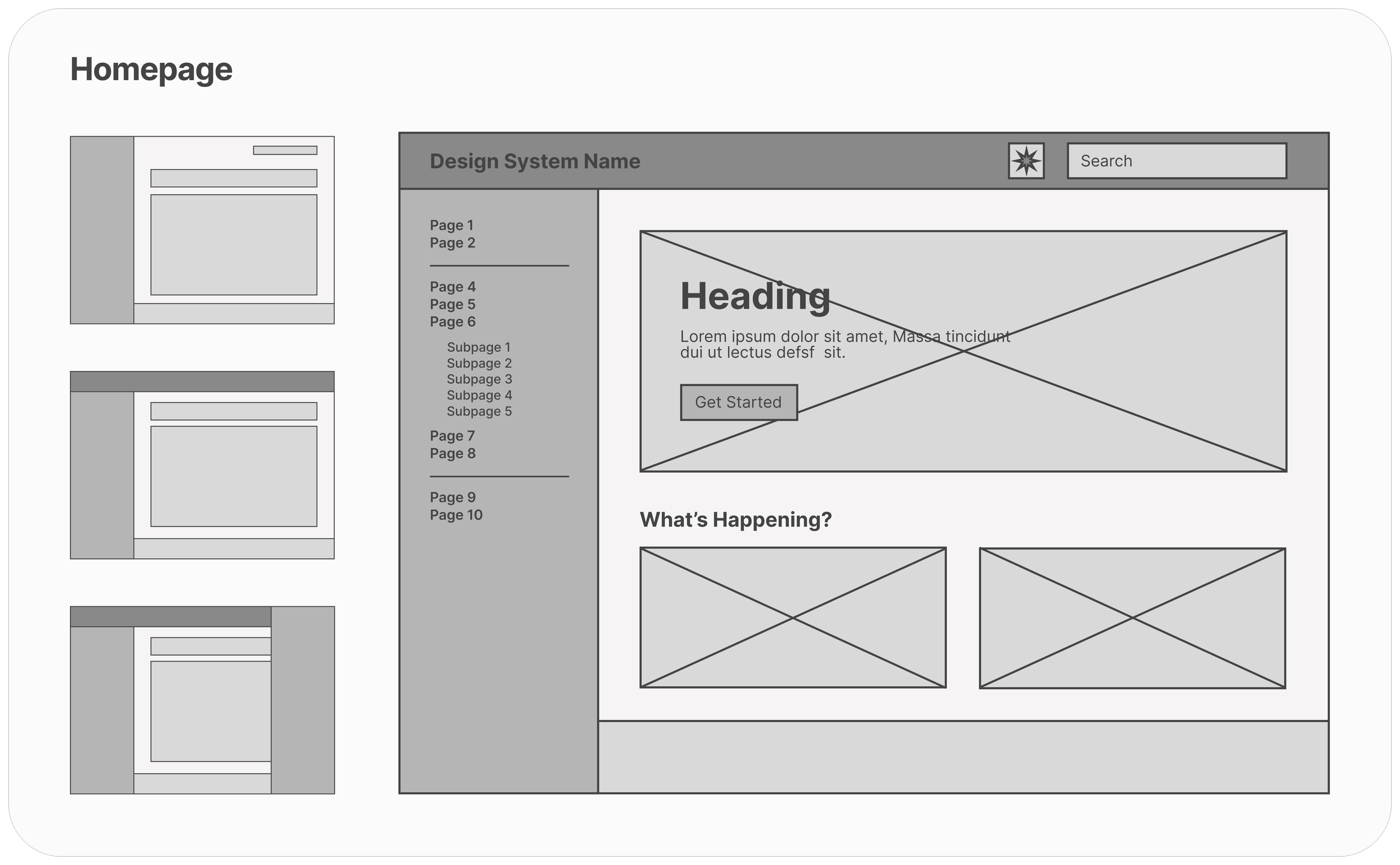
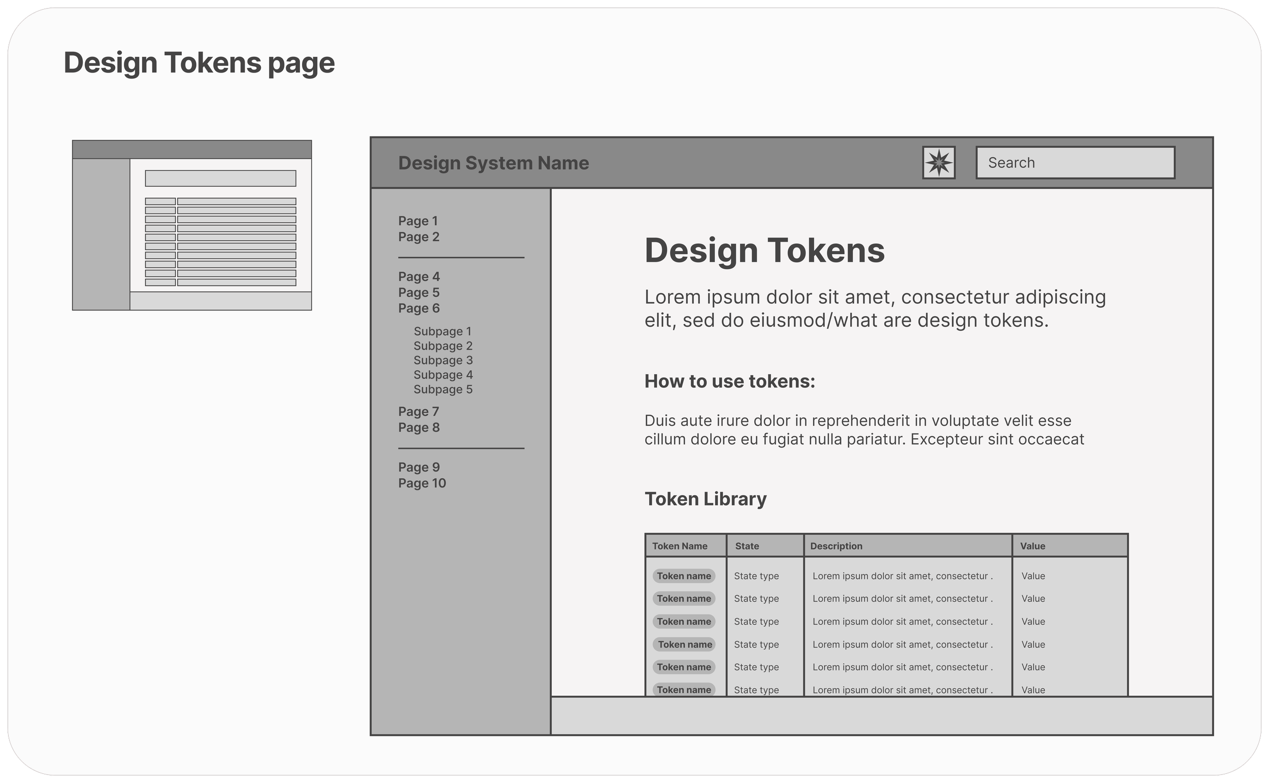
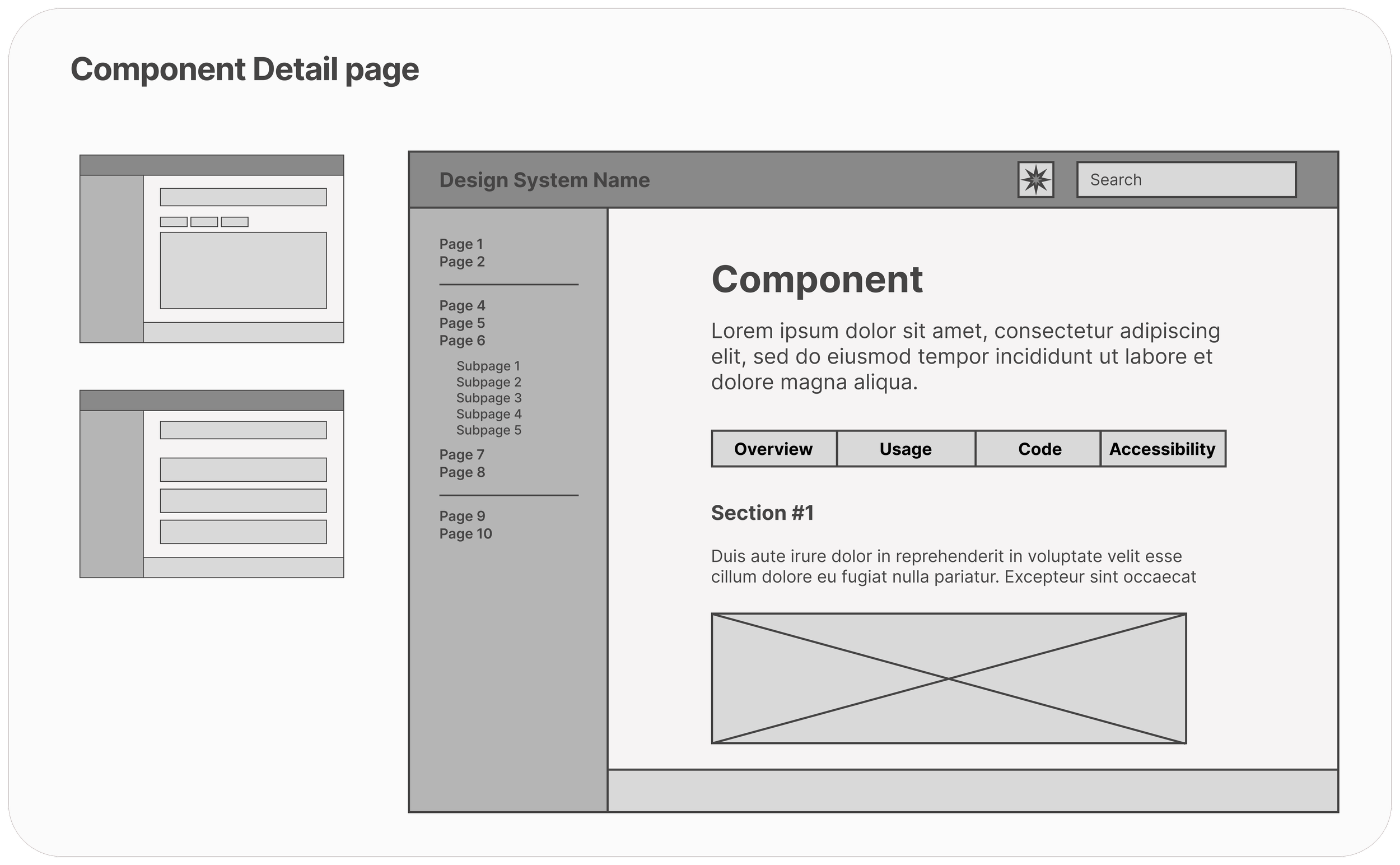
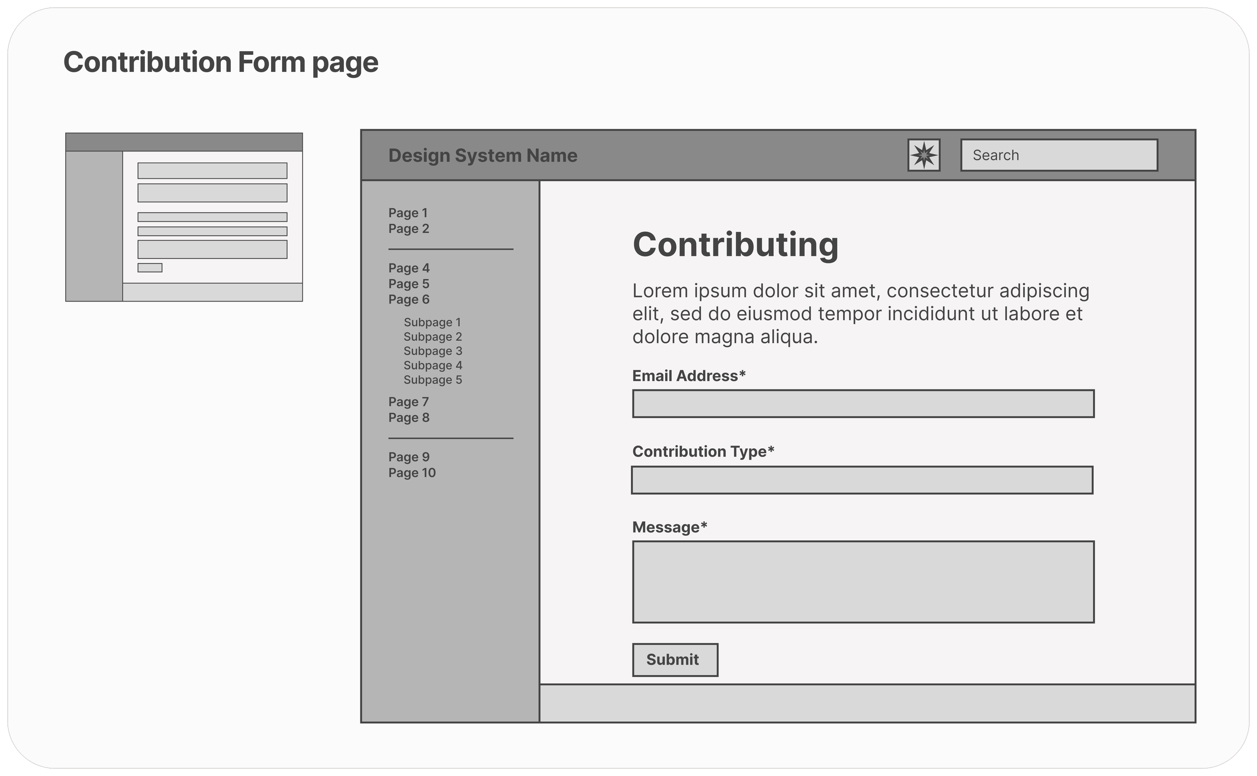
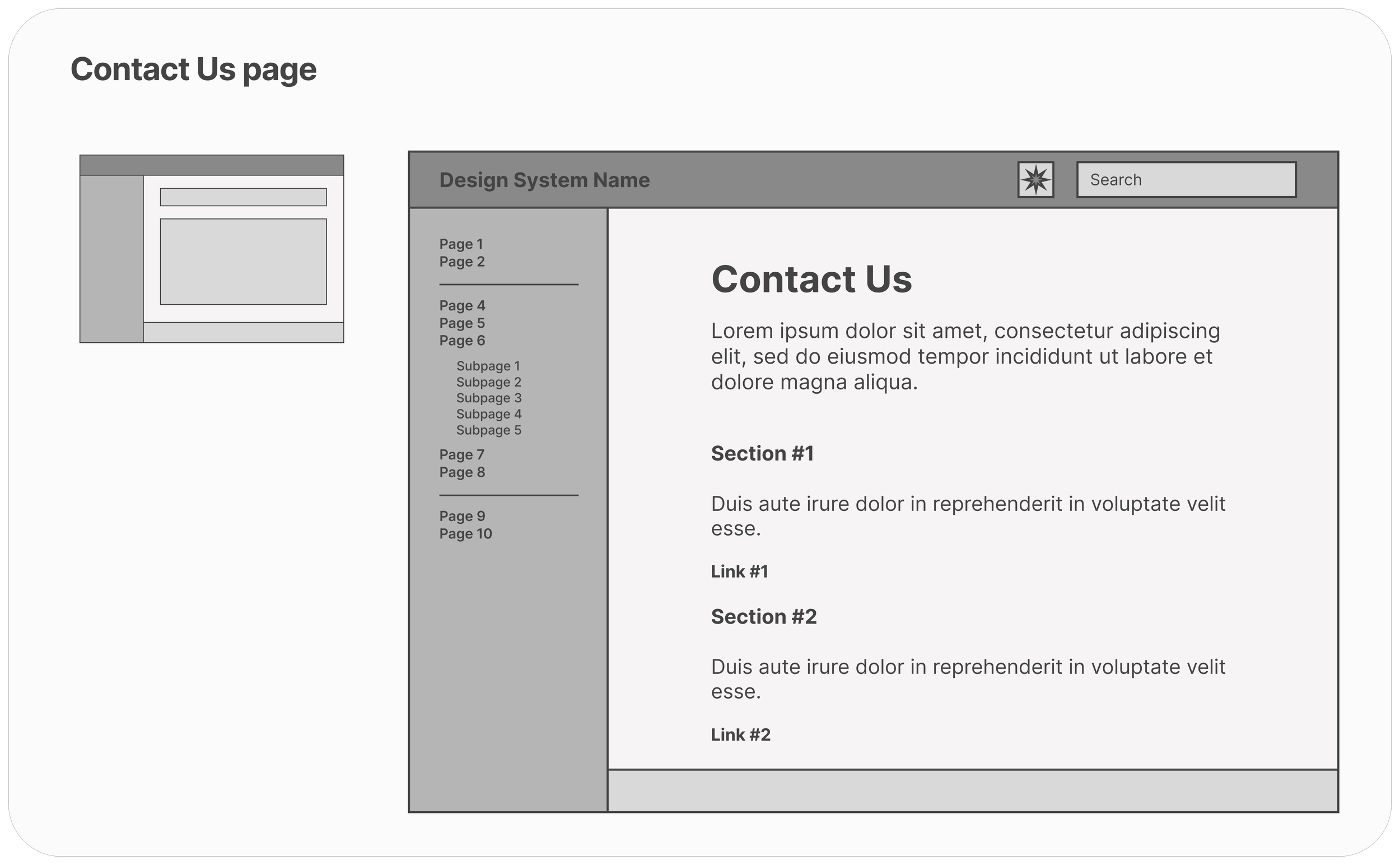
✏️ WIREFRAMING
Sketching it all out.
From pen and paper drawings to low-fidelity wireframes, we explored many configurations of screens before landing on one that fits all of our requirements. The designs we selected have a clear focus on accessibility, engagement and conciseness.
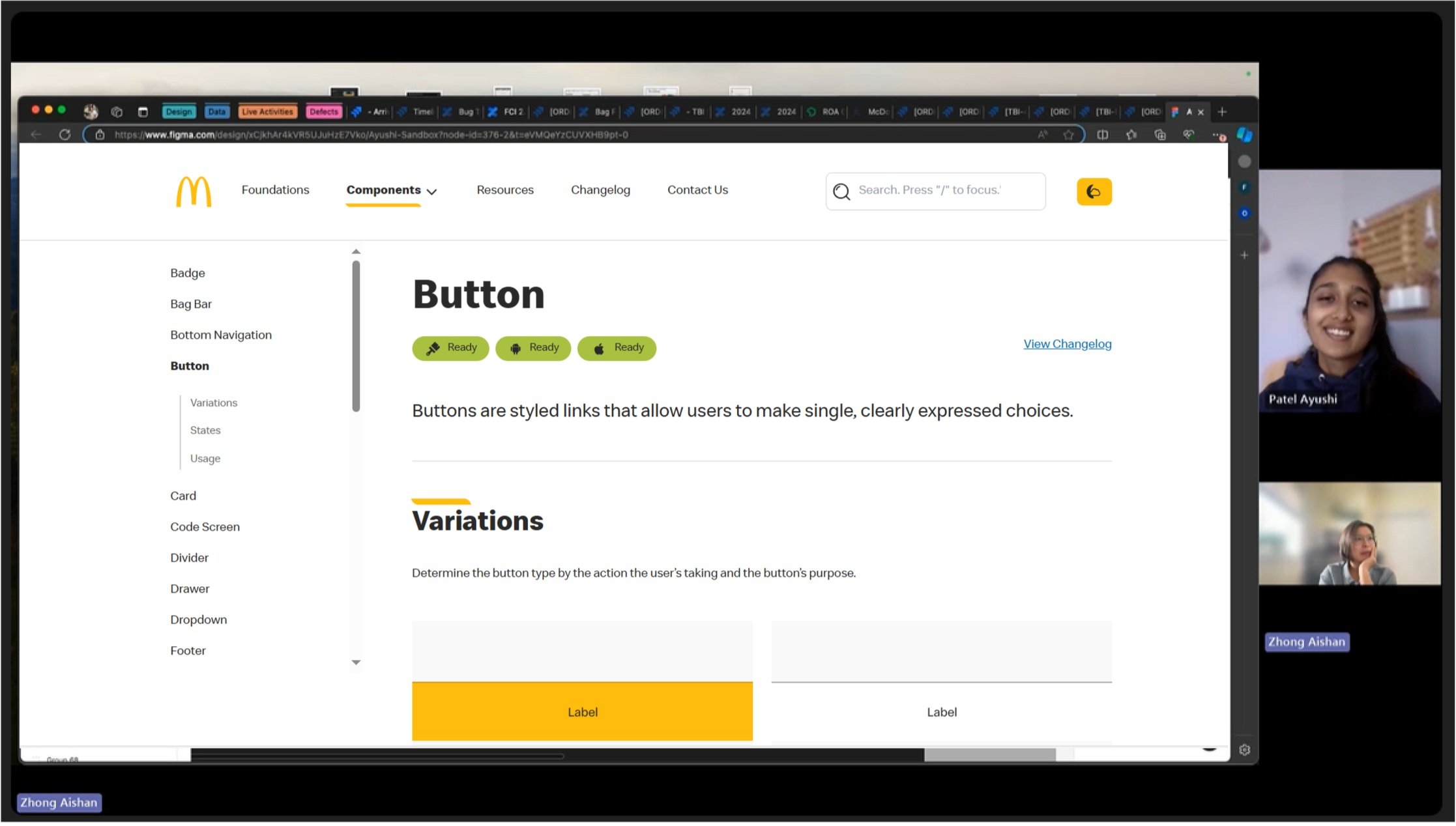
🎨 PROTOTYPE
Bringing it to life.
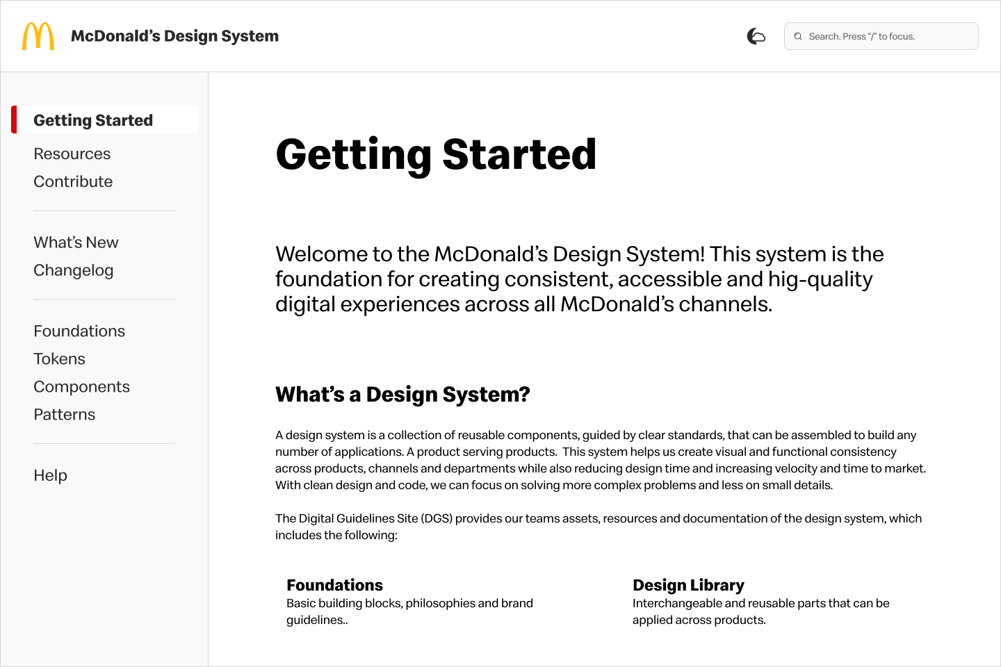
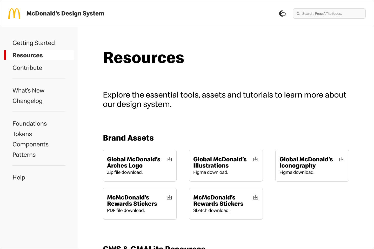
To convert my wireframes into the final product, I took advantage of our design system as the site design should be reflective of our standards. This final prototype answers our users’ needs and provide accessible, clear and useful documentation.
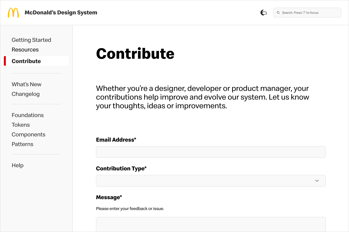
📝 PROBLEMS & SOLUTIONS
Going back to the users.
To confirm the final designs are meeting our users’ needs and wants, I conducted user testing to identify any potential improvements.
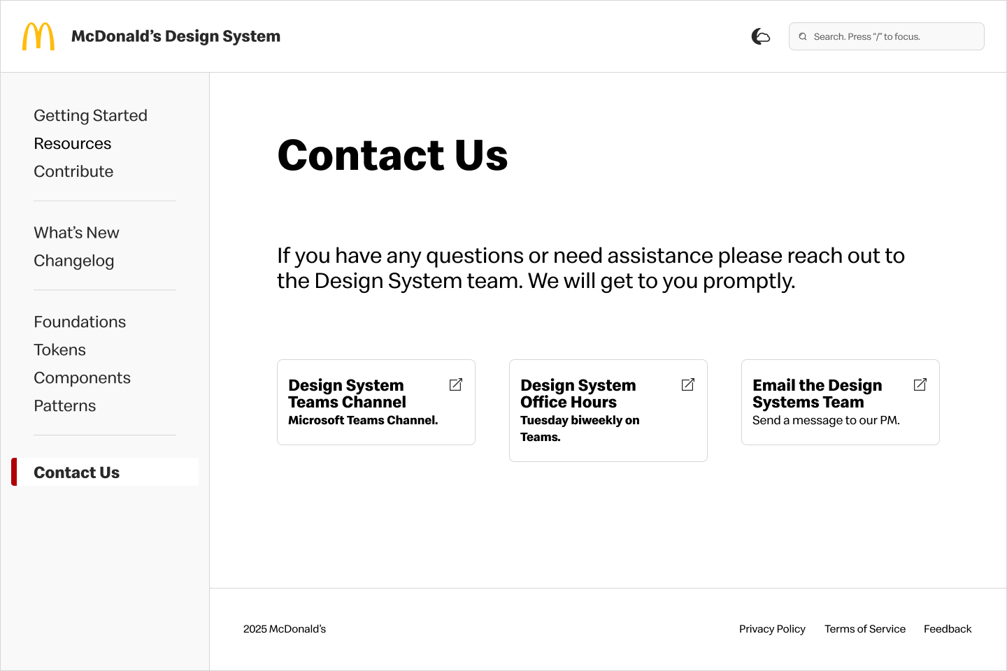
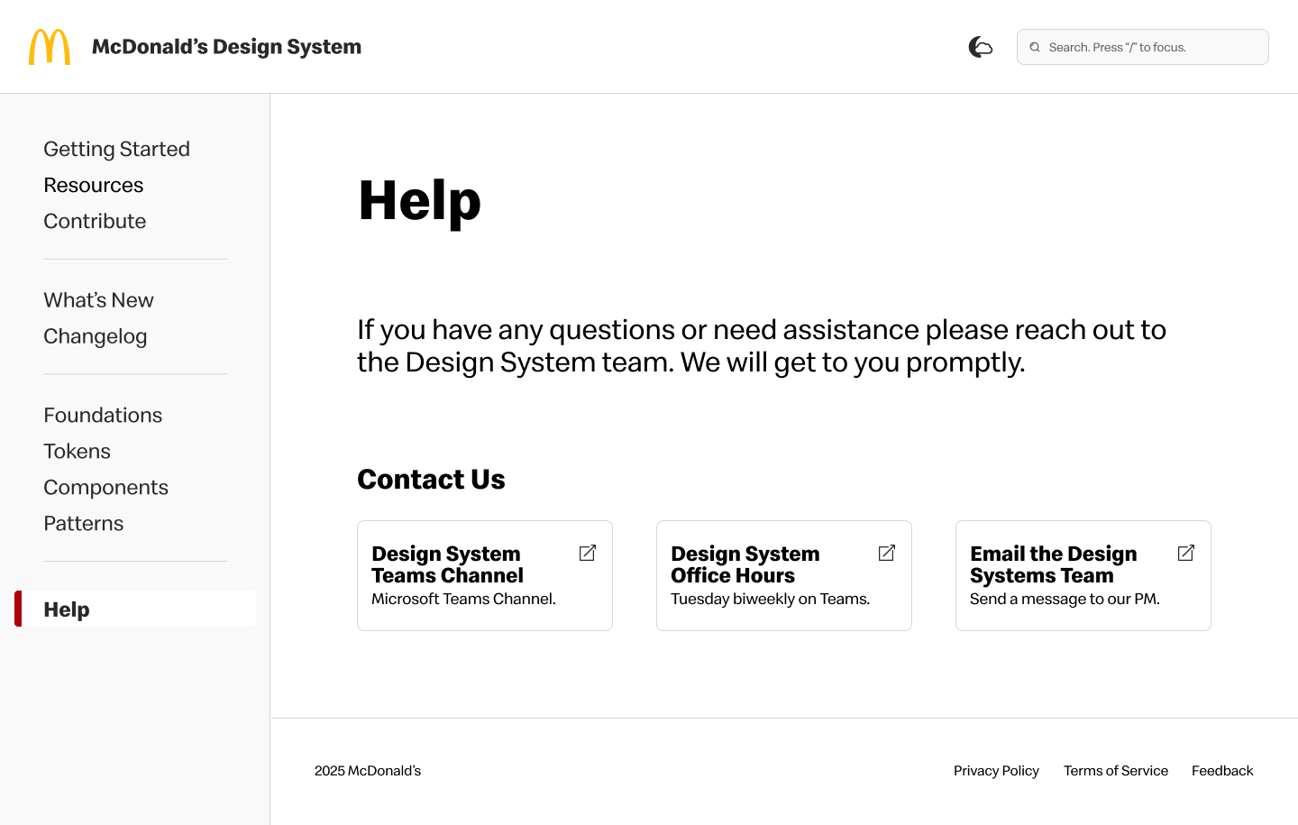
⚠️ Help page only has contact information, which can be misleading.
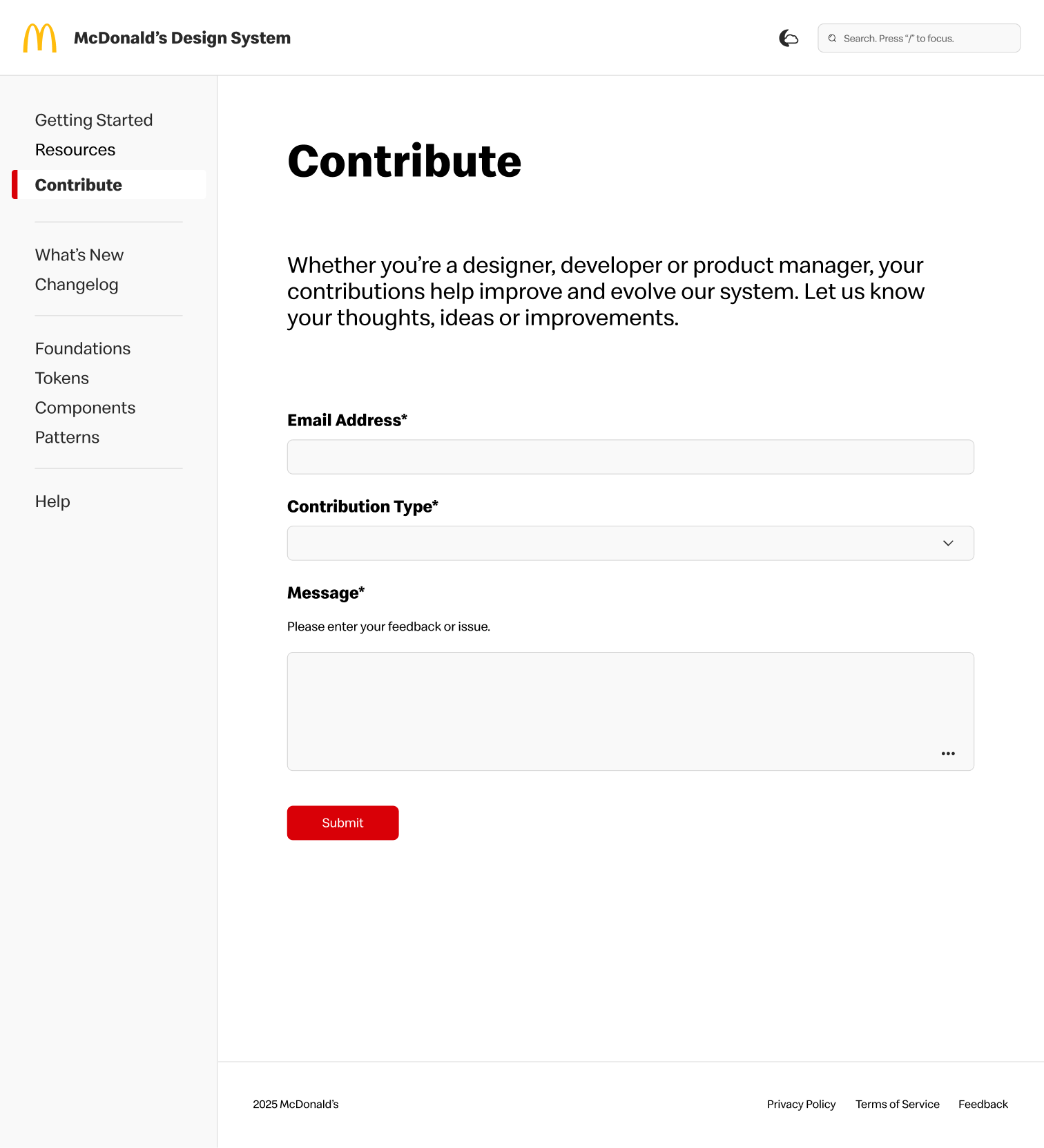
⚠️ Would be nice to send pictures for troubleshooting or files for ideas.
→
→
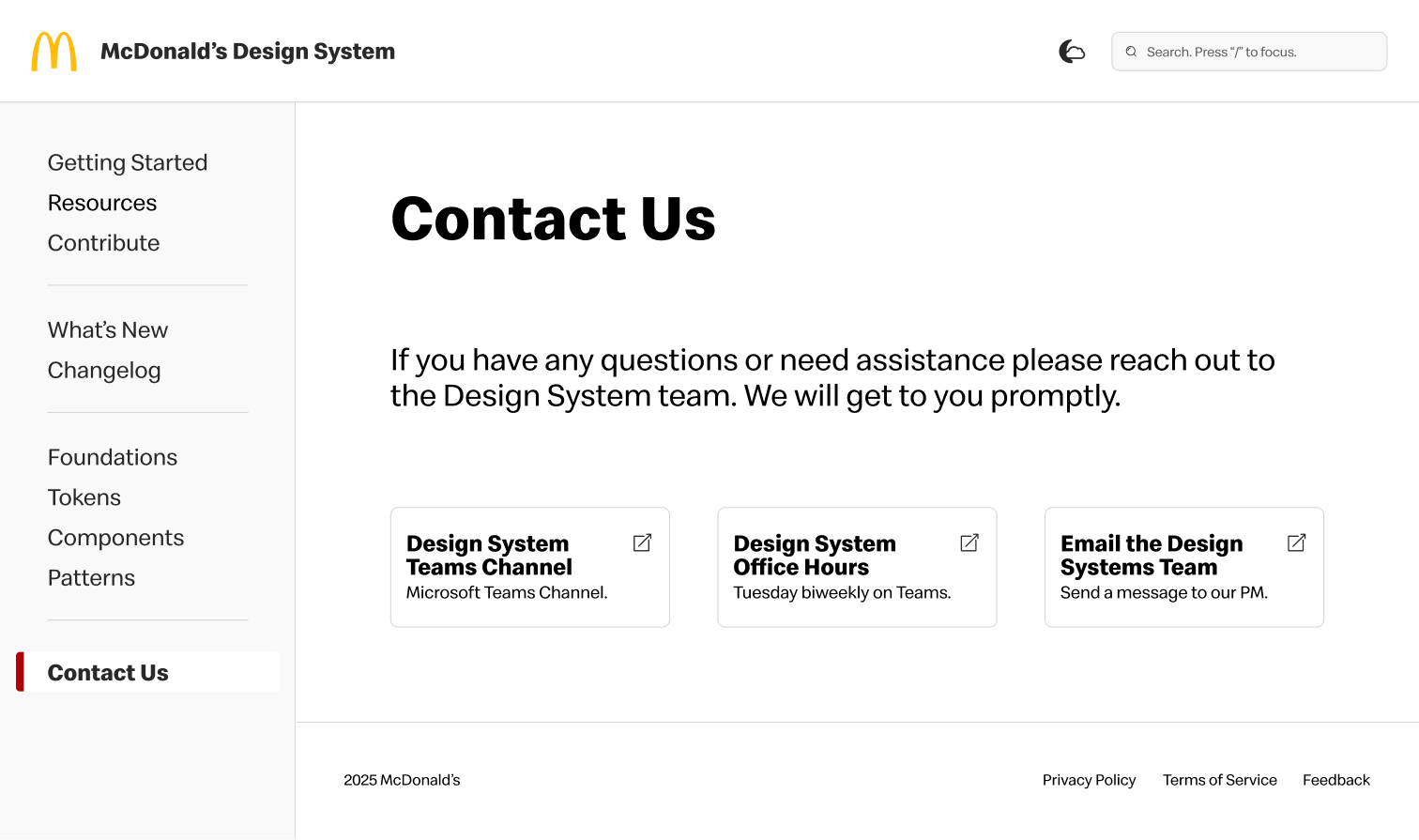
✅ Created more clarity by renaming the Help page to Contact Us.
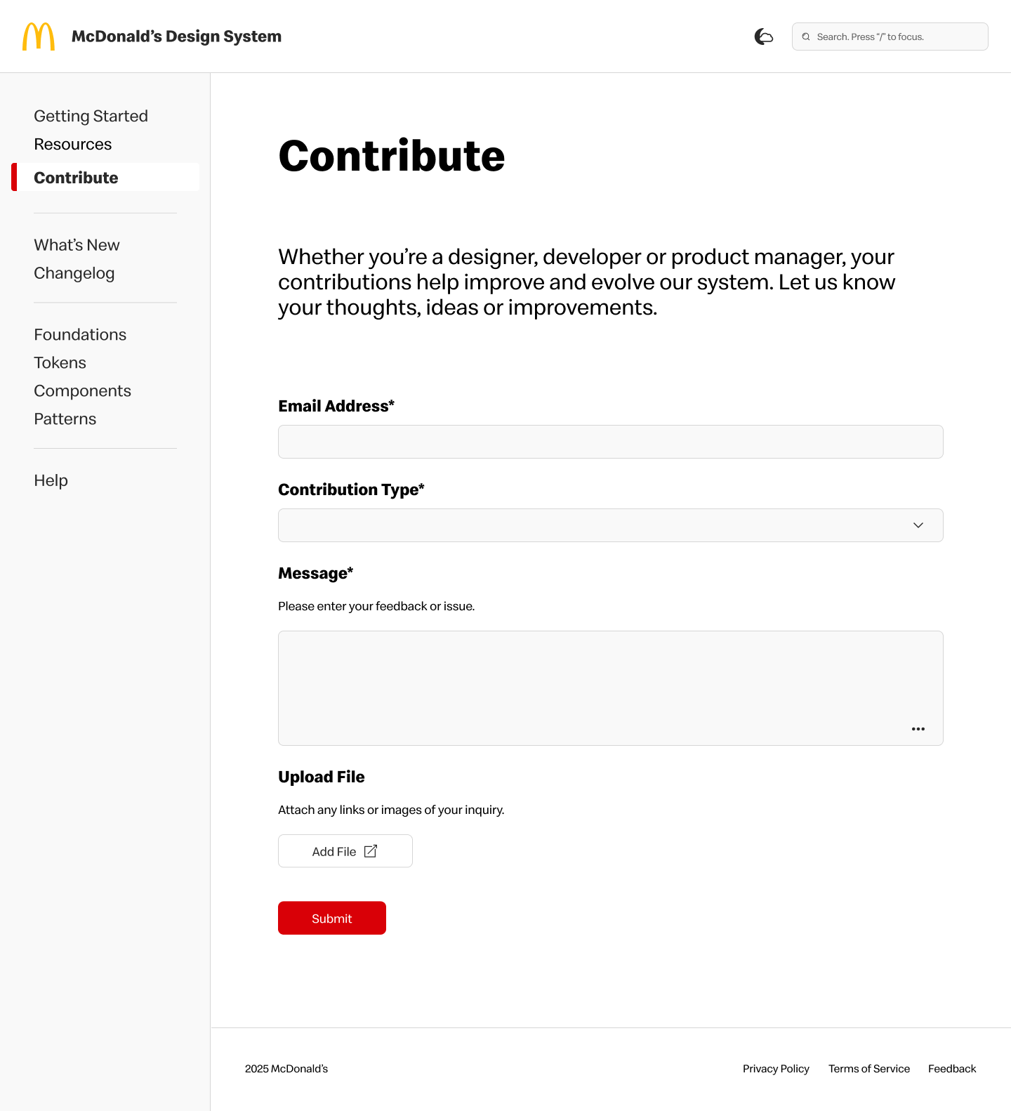
✅ Optional upload section in Contribution form allows more input from users.
🧠 NEXT STEPS
Deploy, govern and evolve.
The next steps are to work with our development team to deliver this newly redesigned documentation site to all of the product teams. The design system team will manage and educate teams to utilize and explore the site to increase visibility.
While this update to the Design Guidelines Site is a big improvement from the last version, there is always room for improvement. As we evolve the design system, the Design Guidelines Site will also need to evolve. Adding in contributions, fixing defects and releasing enhancements will help maintain consistency while scaling to a bigger system and audience.
🧠 LEARNINGS
Key Takeaways.
Throughout this process, I gained valuable insights into designing a documentation site for a first-generation design system. I learned the importance of maintaining consistency while allow flexibility for future growth.