
McDonald’s Curbside Experience
An intuitive and accessible documentation site that centralizes all UX/UI assets for the organization.
INTRODUCTION
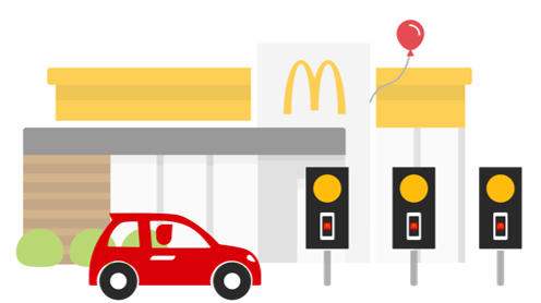
Creating a consistent curbside experience.
Mobile order and pay gives McDonald’s customers the flexibility to choose their preferred pickup method. While drive-thru and front counter pickup offer a consistent experience across the US market, curbside pickup varies due to the differences in parking configurations, signage and fulfillment instructions.
IMPACT
A reliable and efficient pickup option.
From assessing the current curbside experience and evaluating proposed improvements, we made the pickup process faster, clearer and more convenient by clarifying pickup instructions, standardizing navigational signage and creating more discernable parking zones.
TIMELINE
2 Months
July 2022 - Aug 2022
TEAM
2 UX Researchers
1 UX Designer
MY ROLE
UX Researcher
→
TOOLS
Dscout

The Process.
📊 RESEARCH
Research Goals
Methodology
Survey Creation
Analysis Plan
🎨 DESIGN
Test & Iterate
Revised Experience
📝 INSIGHTS
Findings
🧠 REFLECT
Next steps
Learnings
📊 METHODOLOGY
Getting scrappy for speedy research.
Given our limited timeline and budget, conducting an online study was the most effective way to reach a large number of participants across a broad geographic area. Our goal is to gather customer feedback on wayfinding and signage, assess their overall experience, and identify opportunities for improvement.
SCOPE
56 participants
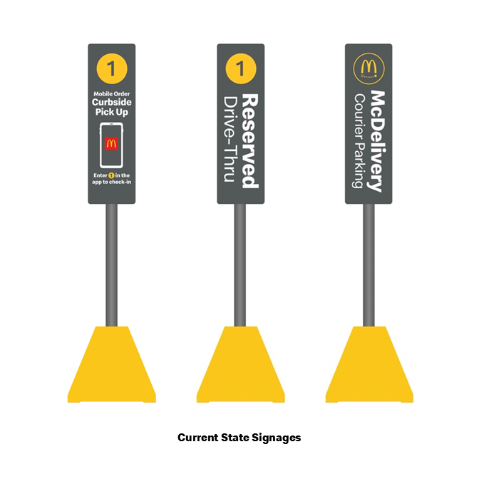
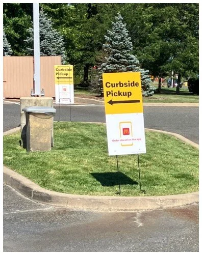
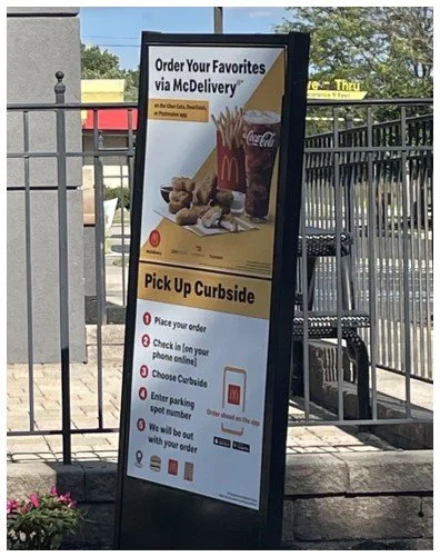
3 signage concepts
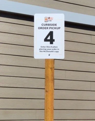
Current state
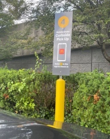
Proposed future state
Dual curbside / delivery signage
Data collected via Dscout, an online research platform
📊 SURVEY CREATION
The study breakdown.
For this study, we used Dscout to recruit participants, communicate tasks, and gather insights. The study is divided into three parts, each designed to address our goals.
A participant screener will first be completed to find customer’s that fit our study. Part 1 explores customers' general experiences with curbside pickup at any establishment, Part 2 focuses specifically on their curbside experience at McDonald's, and Part 3 collects feedback on signage designs.
PART 1: CURBSIDE OF YOUR CHOICE
Participants will select a retailer of their choice, doesn’t have to be a QSR, and experience their curbside pickup.
Along with sending pictures, we asked them to answer given questions in a video to understand their experience, observations and satisfaction.
PART 2: CURBSIDE AT MCDONALD’S
Customers will go to McDonald’s and order with curbside pickup.
The only questions that differ from part 1 are to gage the customers preferences when going to McDonald’s, such as whether they prefer ordering in-store, drive thru or curbside.
PART 3: EVAULATE FUTURE SIGNAGE
Customers will take a look at the existing and proposed signage and provide feedback.
From our initial observations of the curbside experience, we defined our research questions to address how these inconsistencies impact our customers.
📊 RESEARCH GOALS
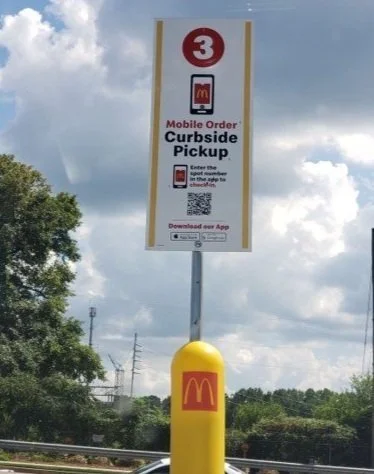
Customers have a different experience at every McDonald’s they visit.
There is a wide variety of curbside signage live in the US market today, every McDonald’s restaurant has different information, colors, fonts and sizes on signage. Locations of the designated parking spots are not clear to find and also are inconsistent.

Creve Coeur, MO
🌟 How can we better understand the existing curbside experience’s impact on our customers?
🌟 What do customers think of the current signage compared to future concepts of curbside signage?
🌟 What contributes to a best-in-class curbside experience? How can we improve our curbside experience?
Farmers Branch, TX
Cleveland, OH
Smyrna, GA
Bellevue, WA
Hadley, MA
Silver Springs, MD
Dresher, PA
PARTICIPANTS
US only (distributed across 10 standard federal regions)
Frequent QSR customers (several visits per month)
Varying exposure to McDonald’s mobile app, ordering ahead, and curbside
A representative mix of demographic sectors such as age, gender, ethnicity, educational level, household income, disability, etc.
📊 ANALYSIS PLAN
Turning findings into actions.
So, what do we do with the data we collect?
I watched every video response from our participants and tagged them according to common themes. Then built a deck to present to stakeholders on how we can use these findings to iterate on our curbside experience. The stakeholders can then revise curbside signage to better fit our customer’s needs.
📝 FINDINGS
Customers rated their McDonald’s experience less favorably compared to other retailers.
From listening to customers’ curbside experiences, most found their McDonald’s experience good but could have been better, specifically with how to get help and notifying their arrival. With this information, we can focus our efforts to these areas in order to create a better customer journey.
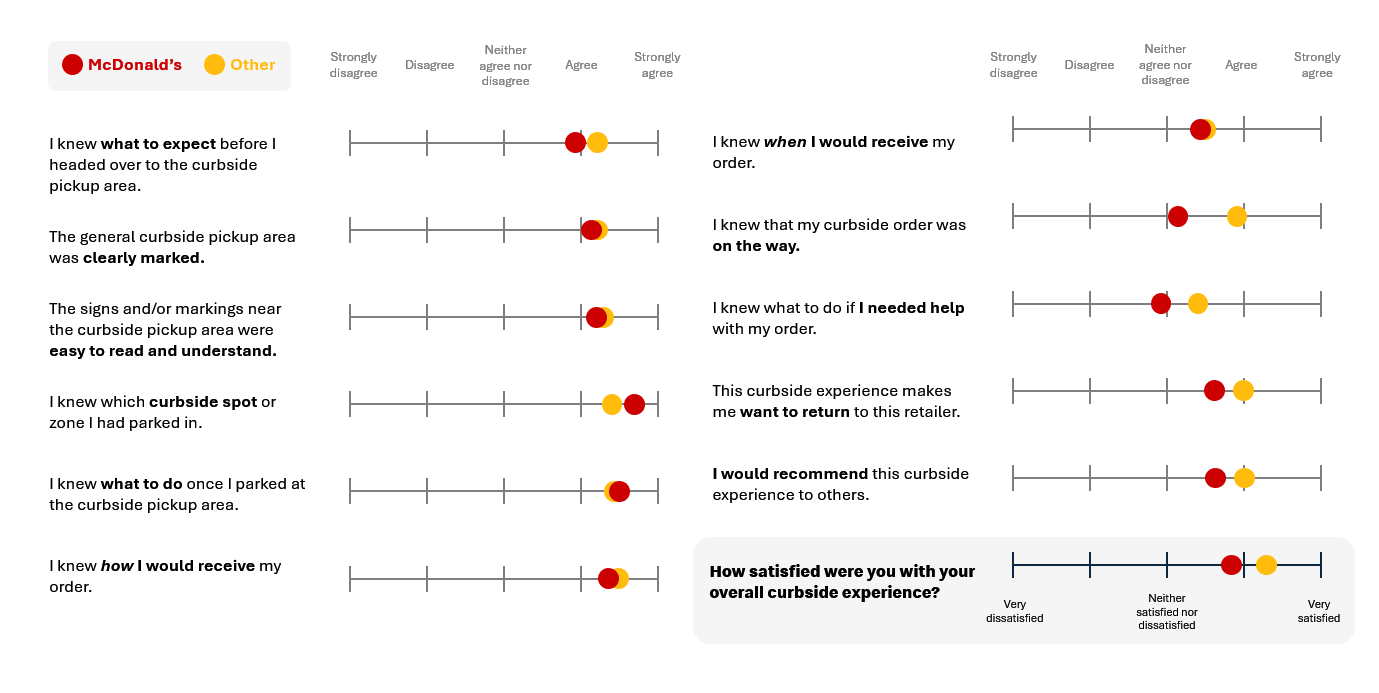
📝 FINDINGS
Although curbside signage was easy to understand, the design made it indistinguishable from afar.
Customers placed high importance on legibility of text, numbering and iconography when analyzing the signages. Overall, the current signages had strong sentiment, which helps us pinpoint exactly where to focus our efforts of improvement.
🖨️ Appreciated simplicity & legibility
🚘 Most liked having distinct signs for each parking type
🛑 Signs were not bright enough or differentiable from a distance
❓ Many did not understand the “Reserved Drive-Thru” sign

📝 FINDINGS
So, what did McDonald’s customer have to say about the current experience?
Quick and easy mobile ordering, clear pickup instructions, simple check-in and highly visible signage are what customers liked best in their experiences. Even with all these positives, customers had more feedback surrounding what they struggled with or ideas of improvement. The biggest themes were around confusingly similar signage, vertical text illegibility and long wait times.
💬“Between the signs at the curb and the icons painted on the ground I had no issues at all finding out where I need to go or what I needed to do.”
💬“I liked that the spots were numbered. I found it a little hard to find the parking spots at first since I drove by the courier parking and drive thru spots first.”
💬 “The [signs] that had the text sideways, I did not like it. Can I comprehend them? Sure! But I can’t imagine reading those late at night when it’s dark and they all look pretty similar.”
💬“It would’ve been a little nicer if there were more markings leading a consumer to the curbside pick up area.”
💬 “All the signage was similar which could possibly get confusing if a person wasn’t paying as much attention.”
🎨 TESTING & ITERATIONS
Design, test, rinse and repeat.
After presenting our research analysis to stakeholders, we worked closely with the restaurant design team to refine curbside signage, ensuring it better met customer needs. Study participants provided feedback on adjustments to the text size, layout, and colors in the redesigned signs shown on the left. While, satisfaction increased with the improvements, there was still room for iteration—leading us to the final signages displayed on the right.
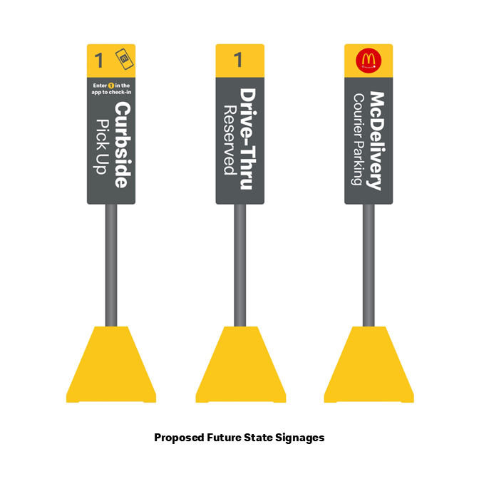
⚠️ Vertical text is very difficult to read and wished text was larger.
⚠️ Designs of each sign were too similar.
⚠️ Confusion with “McDelivery Courier” signage.
→
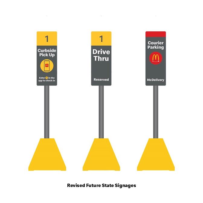
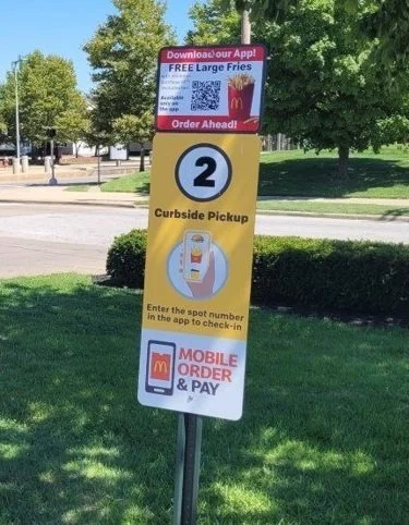
✅ Better legibility with large and horizontal text.
✅ Improved visibility with enlarged iconography and colors.
✅ Simplified signage content for easy comprehension.
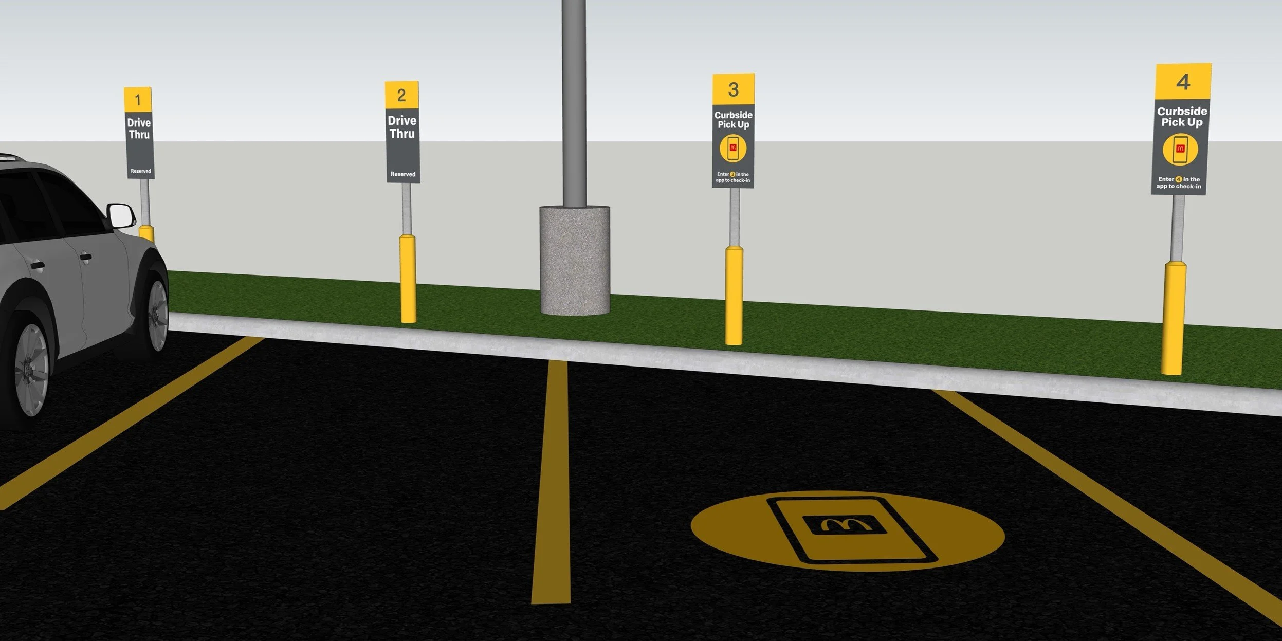
🎨 REVISED EXPERIENCE
Adding the finishing touches for a seamless experience.
Signage plays a crucial role in shaping the curbside experience, however, there are other components of the experience that can also enhance customer wayfinding and the pickup journey. With the addition of bold yellow parking lines and ground markings, designated spots are easier to spot and navigate.
🧠 NEXT STEPS
Standardizing and scaling.
Our study provided us with the confidence to roll out the revised future state signage as the standard of the US market. Because of the success of the research, we expanded it globally into the UK and Canada to assess their curbside experience. They were conducted exactly the same, with Dscout and a 3-part survey. Results of those studies also allowed us to standardize signage in those markets.
🧠 LEARNINGS
Key takeaways.
Conducting UX research through an online study provided valuable insights into customer behavior, pain points and preferences across a large market. The study highlighted the importance of clear signage, intuitive wayfinding and visual cues in creating a seamless experience. Along with gaining more insight into a McDonald’s experience, I learned quite a few skills to add to my arsenal.